

What is Pika?
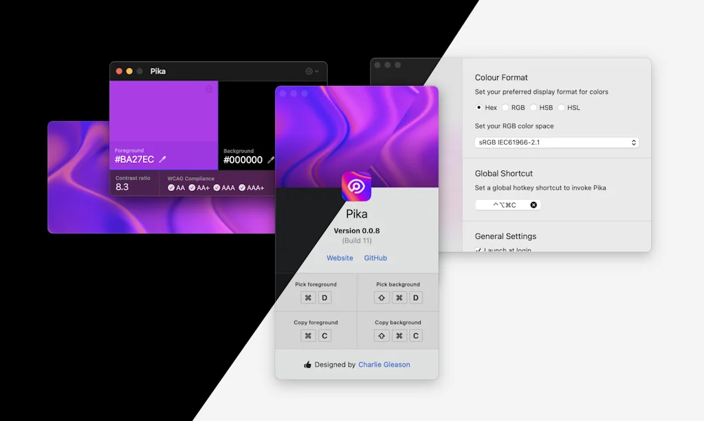
Pika (pronounced pi·kuh, like picker) is an easy to use, open-source, native colour picker for macOS. Pika makes it simple to quickly find colours on screen, in the format you need, so you can get on with being a speedy, successful designer.
Pros & Cons
Pros
- Easy to use
- Elegant design
- MacOS compatibility
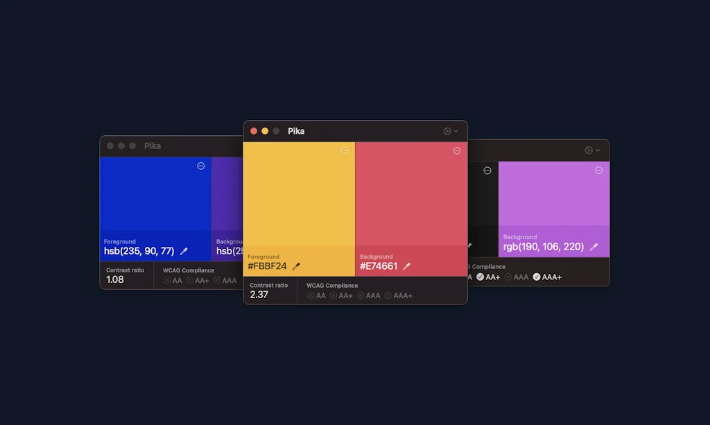
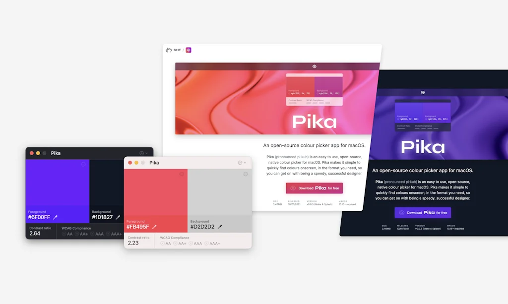
- Contrast ratio checker
- Free
- Open source
- WCAG compliance indicators
- Color comparison
- Fast performance
- Reliable color picking
- Small file size
Tool Details
| Categories | Design resources |
|---|---|
| Website | superhighfives.com |
| Added | February 4, 2021 |
| Platforms | Web |
| Social | GitHub |
Recent Reviews (8)
A nifty utility that is well designed and just works. I’ve used similar tools on macOS before, and Pika is the best combo of practical and reliable I’ve found. It doesn’t seem to struggle with color spaces like some other tools do (i.e., the picked color is usually the color defined in code). My wishes for the future: - show some history of picked colors or color pairs (and their contrast); - APCA contrast calculations would be great, in addition to WCAG2 ones.
Pika is a delightful and elegantly designed color picker. I use it all the time and love the built-in contrast ratio checker. Tons of small details that add up to it being a lovely experience every time I use it.
Amazing tool, coming from all the shady chrome plugins to pick colors this is a game changer
A really simple solution to a regular problem. Brand colour palettes can often be painful to remember and this means I don't have to have several PDFs open to try and get the right colours for social posts.
The simplest, and the most beautiful FREE colour picker for MacOS. Also WCAG compliance indicators are a +++!
Comparing colors side by side is very useful. Also, fast and only 8.4 MB.
In today’s online world it is not optional to ensure that all you do is accessible to all. One big part of accessibility is color choice. I am not color blind but I can’t tell you how often I have been on sites where I can’t read the text due to poor choices of color. Pika solves for that and is extremely easy to use. Pika allows you to see how your color choices contrast and how appropriate (or not) they are to use to be compliant. When I am working on anything online, I always have Pika open. Can’t overstate the importance of this or how useful Pika is.
Great tool and easy to use
Frequently Asked Questions about Pika
When did Pika become popular?
Pika became popular around February 4, 2021.
What are the main advantages of using Pika?
The top advantages of Pika include: easy to use, elegant design, macOS compatibility, contrast ratio checker, free.
What is Pika's overall user rating?
Pika has an overall rating of 5.0/5 based on 9 user reviews.
What type of tool is Pika?
Pika belongs to the following categories: Design resources.
Related Design resources Tools
Backlight
Make design systems that front-end teams want to use
Sketch Viewer
View, version, and share your .sketch files on the web
Color Copy Paste
Copy colors from your phone & paste on web, figma, or sketch
Monolisa
Font follows function
Google Fonts
Making the web beautiful, fast open through great typography
FontJoy
Get smart font pairings in one click
Compare Pika :
Don't Get Fooled by Fake Social Media Videos
The world's first fact checker for social media. Paste any link and get an instant credibility score with sources.
Try FactCheckTool Free