
Craft.do
Your space for notes, tasks, and big ideas
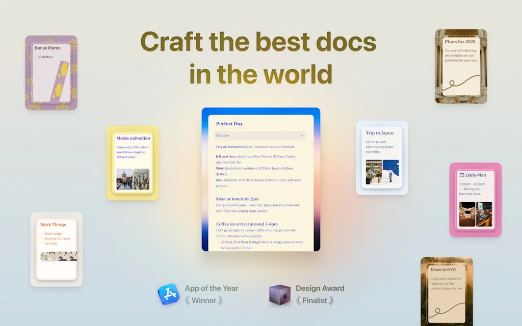
What is Craft.do?
Millions of writers, thinkers and innovators use Craft to capture their big ideas every day.
We believe that how you feel about the tools you use is just as important as the work you can do with them. That’s why we’re bringing the joy back to thinking, writing, creating and collaborating.
Pros & Cons
Pros
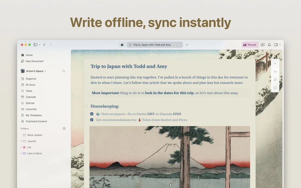
- Beautiful design
- Intuitive navigation
- Collaborative features
- Fast performance
- Content creation
- Note organization
- AI assistant
- Document management
- Easy sharing
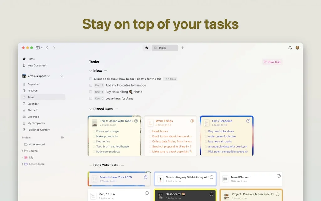
- Tasks and collections
- Block-based approach
- MacOS native
- Smooth integration
- Cross-platform
- Customization
- Rich media integration
Cons
- Complex UI
- Code block issues
- No Android app
- Block-based approach
- Password reset issues
- Poor customer support
Tool Details
| Categories | Productivity, Note and writing apps, Team collaboration software |
|---|---|
| Website | craft.do |
| Added | March 4, 2020 |
| Platforms | Web · iOS |
| Social | Twitter · Instagram · LinkedIn |
Recent Reviews (13)
I use Craft for all of my notes. Great product which allows me the flexibility and customization that I need for notes, without being bloated with a bunch of features that just get in my way and I never use.
Clean, fast block-based note-taking app with some collaboration features—less team-centric than Notion and without Notion's more powerful database features, but otherwise both similar and better.
I'm in love with Craft! From the way it looks, the way it integrates natively with the Apple ecosystem to those little details that count a lot. Great product! My default writing app! ❤️
A friend recommended the tool. He showed me how he built his second brain on Craft.do. I was soooo in love with the visual options and easy to use platform, that I fell in love with the tool. Very recommended, as it's easier than Notion (I also used this for many things, and will review it shortly) and more customizable than Google Docs. I use it as well for Client's documents & procedures and it's great. Better than the other 2 options mentioned.
Here's my 2 cents on Craft as someone working in technology and heavily relying on documentation tools but failed to adopt it as a daily tool despite many attempts: First, the good part: Craft has absolutely every feature you could imagine and is incredibly sleek and well-designed. Now the issue: I can't use this tool for document/note taking in my workflows because it cramps every feature in the UI, which results in endless different views, confusing navigation and animations, and hidden elements behind multi-slide navs. I'll emphasize the first part again: Craft is literally the best-developed note-taking tool I've tried. However, it seems that whoever is managing this product is prioritizing adding every single imaginable feature rather than just focusing on how users actually write notes and documents. This is fairly frustrating because I would truly love to use it daily. I went through the Craft website and read some Reddit posts, and from my understanding, the product is meant to be a "Note"-taking app but with a leap towards turning notes into documents. This is awesome, but it seems like core elements of note-taking have been dismissed, and when I use the app, I am not sure if it's trying to be Notion, Canva, Google Drive, Eraser, or another tool. Here are some examples: For my desktop note taking app, the top priorities are: 1. Create notes quickly 2. Find notes quickly 3. The ability to quickly turn text into a heading/bulletpoint etc Everywhere I go in Craft, I end up getting a different view or UI: in one place, my "notes" are ordered in a grid, in another, in a list, and some notes seem to have "nested" notes, which is ridiculously confusing. I truly fail to understand the point of this, especially as it results in extremely confusing navigation. Then, the tabs: Tabs are great, but just because you can put a search icon that resizes into a search bar in the current active tab is possible does not mean you should. Sure, it's impressive UI, but if i want to switch a tab, the last thing I want is for it to resize on hover to then click the close button or search bar by mistake. For the sake of efficiency, Move the tabs to their own line, do not resize them on hover to avoid confusing the user, and leave the search bar on its own line. Also, maybe reduce the font sizes to preserve UI real estate. Text editing: You've added a "quick" text editor, which is essential, but it doesn't include changing text to a heading or sub heading. Instead the quick menu offers the user to highlight text. So to change text to a heading you have to Select the text > Click on the sidebar > Click on format > Click on the heading. I am fairly sure formatting a heading is far more performed than highlighting text. The code blocks are awesome and offer full syntax highlighting and even theme changes? (Largely overkill if you're asking me, I genuinely don't see what made this a priority), but if you're gonna be adding a code block, the first thing you'll need to do is change the language for proper highlighting. You'd think that can be done on double click? But no, you need to > Double click > Click the "elipsis" icon > click on "Language" > Search for the language you want to use. I could list many other examples of how Craft has become a frustrating tool for normal workflows. If I am writing notes, I'll spend 90% of the time writing and formatting them. I am not expecting to be taken through a UI presentation of every possible animation, masonry layout, or UI component. It's crazy because, for me, this could be the best notes-taking app ever made if they just removed a bunch of stuff and simplified the UI to prioritize putting controls where they should be.
I've tried several note-taking apps and eventually I stick to Craft. Now I've been using it for almost 3 years(longer than any of my relationships). I'm writing this cause I really wish the Craft team can do better so I dont need to move all my docs to another app :( Since I updated the last version I feel a little confused, although the layout seems clearer, I took some time to get used to it. For me, the most important thing of note-taking app is allowing me to write diary and organize my docs in one place. Writing diary is the most common writing scenario and I dont want to separate these writing actions in two apps. The most comfortable thing is when I enter Craft, it opens today's doc automatically. Please make sure Craft would remian the month layout and open daily doc forever
Craft is a great application. It has an outstanding visual design. No one can beat it for visual design in all note taking applications. Bidirectional links are great, but not practical enough, and lack some very key features compared to Roam Research: content referencing and auto-linking, custom templates. This forced me to use it as a backup notes app, even though I love their visual design.
Great-looking app. Super intuitive and easy to use. But it does have a couple of quirks that make me raise an eyebrow. I shouldn’t have to go through a whole ritual to convert cards to links. I just want a plain text link. Also, the code block seems to have some issues. Trying to copy bits of code, especially if you highlight backward, often just gives you line numbers instead.
Craft is such a fantastic tool—beautiful design and super functional! Love seeing how it supports both work and personal needs, especially with features like AI and rich media integration. One suggestion to consider for gathering user feedback: tools like Feedspace let you create custom forms and collect reviews or feedback in audio, video, or text formats, making it easy to capture diverse feedback. It might be a helpful addition to Craft’s feedback process to see even more ways users engage with the app! Keep up the great work; excited to see Craft continue to evolve!
Craft is a game-changer for content creation and one of my absolute favorite tools. I use it for my entire content creation process. Its block-based approach is revolutionary, allowing me to mold text like never before. It's incredibly liberating and makes me wonder why no one thought of this sooner. If you're a content creator, Craft is a must-have. The recent addition of tasks and collections makes this even better!
A great way to lose all your notes! The password reset/verification code feature doesn't work, and I have no way of accessing my account. Support is almost nonexistent, and doesn't provide any meaningful help. I'm not sure what to do to recover my notes and account, and Craft seems to be fine with me losing everything. Avoid using this app if you need to have reliable access to your notes.
Craft.do is getting better and better. I can see that they are constantly improving this App. The most fundamental reason I choose to use Craft.do is because it is very beautiful and 🚀 fast. But I can't completely own my notes in markdown format. I need a full local backup.
Frequently Asked Questions about Craft.do
When did Craft.do become popular?
Craft.do became popular around March 4, 2020.
What are the main advantages of using Craft.do?
The top advantages of Craft.do include: beautiful design, intuitive navigation, collaborative features, fast performance, content creation.
What are the disadvantages of Craft.do?
Some reported disadvantages of Craft.do include: complex UI, code block issues, no Android app, block-based approach, password reset issues.
What is Craft.do's overall user rating?
Craft.do has an overall rating of 4.6/5 based on 37 user reviews.
Is Craft.do available on mobile devices?
Yes, Craft.do is available on iOS (App Store).
What type of tool is Craft.do?
Craft.do belongs to the following categories: Productivity, Note and writing apps, Team collaboration software.
Related Productivity Tools
Related Note and writing apps Tools
Doco
AI Agent for Microsoft Word
Ideaverse for Obsidian
A Starter Kit to Manage Your Whole Life
CopyFrame.com
Writing and wireframing tool for freelance copywriters
genei beta
AI-generated summaries for any article or research paper.
Mind Studio
A visionOS app to expand your mind into your space
Ewolve AI
All in one AI for all content creators
Related Team collaboration software Tools
Coverse.one
Organize your documents and the teamwork around
Tower – Git client for Mac and Windows
Build Better Software
Korgi
AI-built project boards powered by your productivity stack
Microsoft Outlook Calendar Pack
Sync, organize, and create your Outlook events into Coda
Xmind AI
Collaborative mind mapping tool enhanced with AI
Wrenly
Free kudo / recognition boards with absolutely no AI
Compare Craft.do :
Don't Get Fooled by Fake Social Media Videos
The world's first fact checker for social media. Paste any link and get an instant credibility score with sources.
Try FactCheckTool Free